


🌈🌍🖼 Foundation - The Holy Grail of User-Experience Design

Look at this beauty: https://fnd.info/
Today’s sponsor is the 🔥 Zima Red podcast 🔥 Check it out if you want to learn from the creatives and builders that are driving our ecosystem forward.
🚀 Also, subscribe to this newsletter if you enjoy the content 🚀
I recently wrote a blog about how NFTs will bring crypto into the mainstream because most NFT-related use cases are games or game-like applications, which obviously tend to be more fun and user-friendly. Since most crypto projects are totally new concepts to the majority of people, the crypto ecosystem should indeed prioritize building easy and fun applications to gain more traction.
Now, I must highlight one crypto company that has taken user-friendly to a whole new level. Foundation is a startup that bills itself as a “culture exchange.” What that means, in plain English, is that they are a platform that allows creators to sell limited-edition goods, such as clothing, art, music, and really anything at all. The products are first bought as tradeable digital tokens that can eventually be redeemed for physical (and soon to be digital) products.
The most interesting part about Foundation, however, is that they have created perhaps the best user experience in the entire crypto ecosystem. They created an incredible dashboard for their marketplace called Terminal, which impressively simplifies a concept so esoteric that it didn’t even exist a year ago.
Foundation refers to Terminal as “culture’s Bloomberg terminal,” and that hits the nail on the head.

When first entering Terminal, users can clearly see the marketplace’s total volume and total number of products. You can also view each listed product’s name, creator, supply, price, volume, and all other relevant information.

After clicking on a specific product, a new window opens to show more detailed information.

If you scroll down on this same page, then you can clearly see each time the product was traded, including the buy or sell amount, value, and date.
So, why does this matter? Simply because I believe that Foundation’s Terminal has the best user experience in crypto. The whole design is simple, clean, inviting, and fun. Considering that the entire crypto ecosystem is new, weird, and sometimes confusing, a crypto product that so clearly displays all relevant information is a breath of fresh air.
Now, let’s compare this to Curve, the decentralized Uniswap-style exchange for stablecoins.
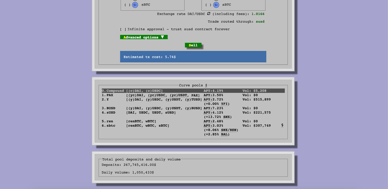
While I have used Curve and agree it's an amazing piece of technology, the layout of the website is extremely confusing and not very inviting. In order to get wider adoption, we need to make products simpler. In other words, more like Foundation’s Terminal and less like Curve (no offense Curve peeps, I love your product’s technology!).
Foundation was able to take something as esoteric as a crypto-powered marketplace and make the experience friendly, fun, and simple. I consider Foundation the holy grail of user-experience design, and not just in regards to their Bloomberg-style terminal. Their main website is incredibly appealing too.


To sum it up, design is a critical element of attracting new users into the ecosystem. I encourage everyone to explore and get inspired by the beautiful things people have created in crypto, starting with Foundation’s appealing products

If you liked this content please subscribe to my newsletter, Zima Red, and give me a follow on Twitter. Stay tuned for more articles on unique digital assets and all things virtual 😎